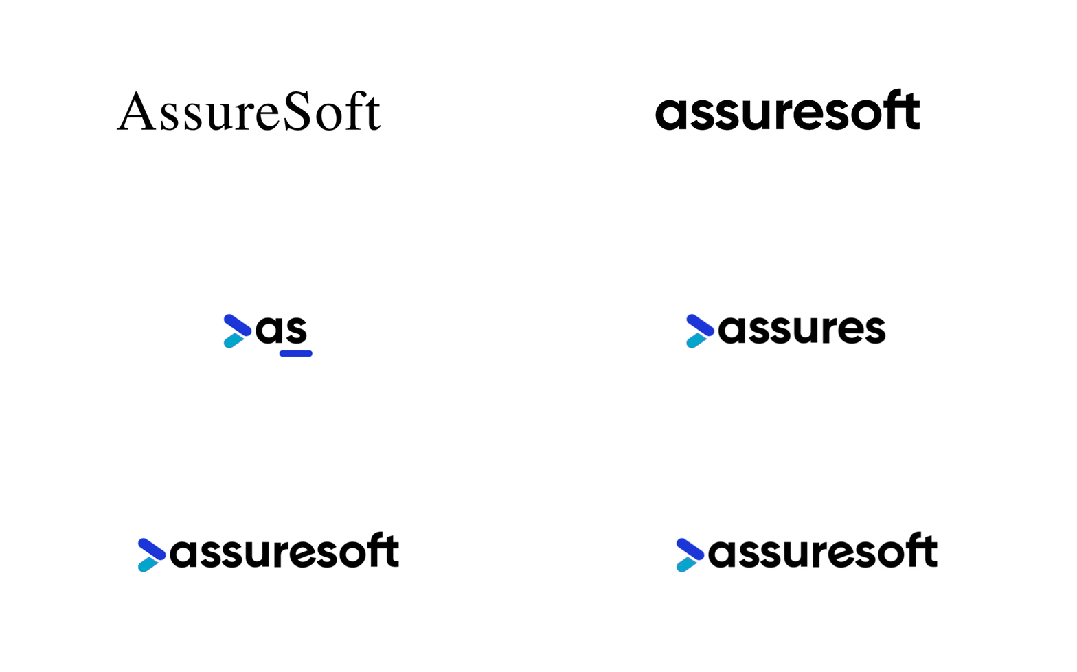
Ever since Daniel Gumucio founded it back in 2006, AssureSoft has been at the forefront of software development in Latin America. Throughout its almost 2 decades of existence, the company never stopped growing, from opening our first development center in Cochabamba, Bolivia, to expanding our operations to Paraguay, Colombia, and Brazil to better serve our clients across multiple countries. But that’s just the beginning.
We’ve been making several strategic decisions and taking decisive steps to get to the next level. Based on our pillars of forward-thinking, transparency, and quality, we are now building the next stage in our growth journey which will lead us to further expand across Latin America. In short, we’ve evolved. That’s why we felt that the way we present ourselves also had to evolve. That thought was what drove us to come up with our new look and feel — a novel visual representation of that evolution.
“The evolution of the AssureSoft brand is more than just a visual update. In reality, it marks a pivotal moment in our company's growth and maturity. As we embraced this transformation, we realized we needed our brand’s identity to mirror the strategic advancements we've made. That’s why we refreshed the way we look: to reflect the high quality of our services, the sophistication of our solutions, and our commitment to continuous growth, essential elements to lead in a rapidly changing landscape.”
Daniel Gumucio, CEO of AssureSoft.
It was crucial for us to update our entire style and look for this new chapter in AssureSoft’s life. That means we’re revamping our logo, color palette, and fonts as well as refreshing our online presence. Here’s what we did and why we feel it better represents who we are right now.
A Logo To Evoke Assuresoft’s Soul
When we set out to find our new logo, we wanted to come up with something able to truly capture the essence of our company. Basically, we were after a visual representation capable of conveying our core pillars: innovation for all projects, commitment to high quality, passion for what we do, transparency in our work, and dedication to excellence. We also wanted a modern logo that would clearly communicate the type of services we offer.
After a long search and many iterations with the design team, we arrived at what we were looking for. We agreed that the greater-than symbol works perfectly as a representation for the software development world, especially coding. The symbol frequently appears in many programming languages, so the connection between it and what we do feels evident.
Used as an isotype, the symbol can also be interpreted as an embodiment for advancement and progress. This suggests a promise: that AssureSoft will always move forward, seeking solutions while continuously improving our services. Finally, the symbol is highly recognizable, reinforcing our idea of simplicity and efficiency in everything we offer to our clients.

The isotype is complemented with the company name written in a brand new font in its bold form. We picked this particular font because it doesn’t just suggest strength and a firm presence but also continuity and renovation. Though that sounds contradictory, it makes perfect sense for us. That’s because the font was already part of our visual legacy, but we introduced some tweaks to truly make it our own. In the end, it serves as a metaphor for how AssureSoft can take the best of its resources to bring it to the present in an improved and refreshed way.
The combination of both the logo and the new font makes for a vibrant isologotype that breathes new life. Its colors and design transmit modern vibes, coupled with high energy, creativity, and trust. Overall, the new logo highlights our unique and no-nonsense approach to what we do.
A Lively Palette
Aside from the new logo and fonts, we are also embracing an entire new palette for our digital presence. It was obvious from the get-go that we needed colors that better represented this new stage in AssureSoft’s journey. That’s why we took the time to carefully select a new lively palette, thinking of the intention and meaning of each of the tones we chose.
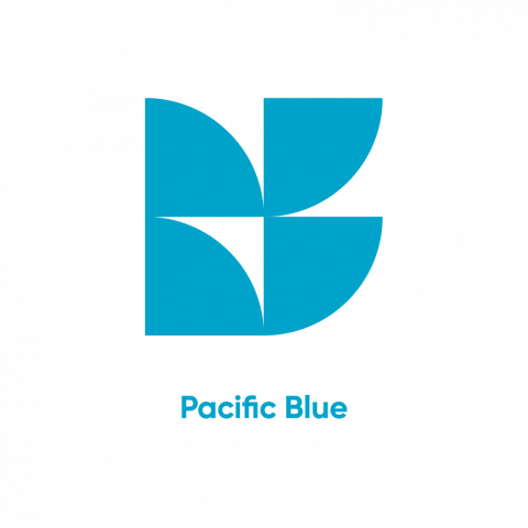
At the very center of our new color set there are 2 shades of blue. The darker one is Persian Blue, which traditionally stands for trust and professionalism. The lighter shade is called Pacific Blue, which symbolizes creativity and adaptability. Black and white complete our primary colors, as they represent the simplicity and clarity in our communications.
Primary Palette

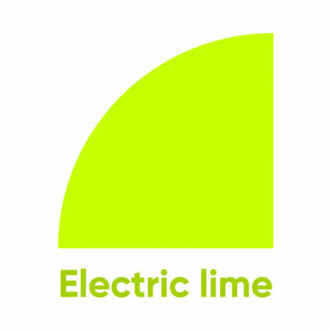
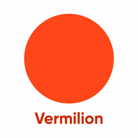
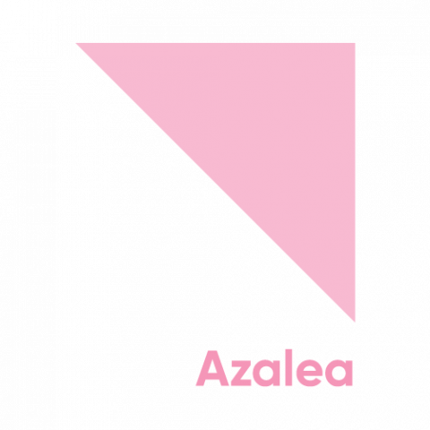
While the primary colors are the core of our brand’s visual representation, our new secondary palette brings our vibe to a whole new level. Using bold tones such as Electric Lime, Plantation, Vermilion, and Azalea allows us to convey other essential characteristics of AssureSoft, from our focus on innovation to our openness and inclusion.
Secondary Palette

The Kickoff for Something Great
We see this brand makeover as the first step towards a whole new era for AssureSoft and our clients. That’s because this is more than just a visual refresh — it’s a hint of things to come. Alongside the redefinition of our brand’s platform and our new marketing programs, the makeover signals towards our new horizons.
We are now firmly aiming to multiply our growth rate, incorporating new clients and tackling exciting new projects. We are also working to expand our reach with a twofold purpose. First, we want more and more companies to access the best talent Latin America has to offer. And second, we want to provide better work opportunities to software developers across our region.
We believe that this visual overhaul better fits what we’ve always offered to our clients and team members. But we also feel like it’s the way in which we can show we are evolving — and we want to take you on that ride with us. Are you ready? Let’s build the future of nearshore software development together!
